Kartflash
Launching a niche grocery delivery service in the Bay Area
Kartflash was a grocery delivery app, which has since pivoted to making speciality foods and halal meat more accessible through delivery. The founder came to us with a prototype that he built by himself, and an ask to help them establish a clear brand.
Starting from Scratch
In order to get a sense of direction, we shadowed Kartflash as they held user interviews and initiated partnerships to add new products to their offerings. Since Kartflash is about bringing convenience to daily life, we knew the digital experience of it had to be embody ease, while creating a lasting impression. We illustrated supermarket scenarios to empathise with customer painpoints of long lines during post-work peak times, and allowed website visitors to gain an insight into how to use the product before signing up.
Communicating Convenience
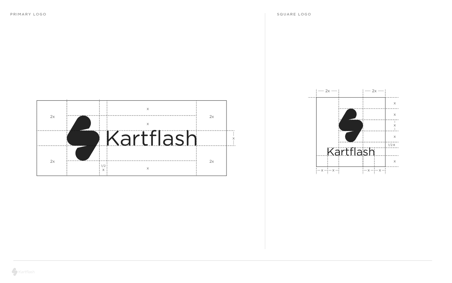
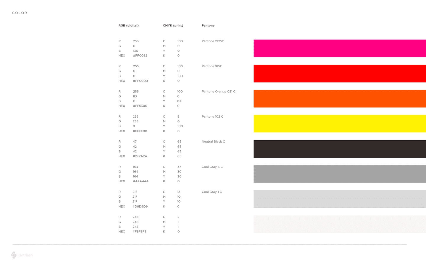
As Kartflash was still finding product market fit, we also wanted to ensure that the brand could be clear and unique, but flexible enough to accomodate future change. We created brand guidelines, and a unique identity centered around a bold orange brand colour, to equip Kartflash for future iterations of the product.
New Paths
We understand that startups need flexibility and speed to go through iteration loops, and are likely to pursue new directions. Now that Kartflash has found some initial traction in a niche untapped market, they're venturing on to validation and growth with opportunities abound.
_Work
- Branding
- Illustration
- iOS Development


